Space! The final frontier… of design. These are the voyages of your laborious enterprise. Your continuing mission: to explore new dimensions, to seek out new layouts and new arrangements, to boldly go where no designer has gone before…
Have you ever turned a page in a magazine, and upon first site of an article you just didn’t feel like reading it? Perhaps you’re browsing through the homepage of a website and you just can’t seem to find the section you’re looking for. Chances are, the space is not being used wisely in these culprits’ layouts.
In design we strive to communicate the most refined and effective message through the work we produce. Space is a most important, and sometimes underrated, factor in achieving a successful design.
Why is space so important, you may ask?
Let’s say you have a website that sells… chips! : )
The goal of the site is to 1. inform the viewer about the product, 2. convince them it’s better than other chips, and finally 3. get them to place an order.
Now, think of your layout as a map. Your job is to guide the viewer through each section in a particular order and get them to the intended destination: BUY! Let’s see how the layouts below fare against one another.
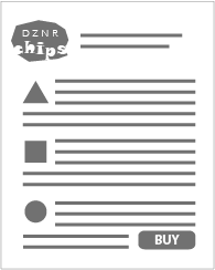
First example. The layout is fairly easy to understand. You read top to bottom and find the BUY button. But it just looks like a long list and is not very inviting to read.
Second example. This layout is a little more interesting and visually appealing. But overall it is still busy and the order in which to read is unclear. The viewer may lose interest before even getting to the BUY button.

Third example. Here there is no confusion in the flow of the layout, the content has been refined and is much more pleasant to take in as a whole. This design is the most successful in getting you to the BUY button.

Your layout should breathe, be inviting and have focus. Your main point of interest, or target area, should stand out from the crowd. Having space around that target area can accentuate its importance. When used appropriately, space gives your design balance, order and direction. Your audience should navigate your layout with ease and clearly understand what you are trying to communicate. Space can create that path towards the intended destination of your design. Which is important if you want the viewer to feel your message was successful and worth their invested time. No one wants to read a cluttered mess.
We are trying to create visual balance and harmony. Also, just because there’s empty space does not mean it needs to be filled. We’re not trying to plug up a leaky dam here. Although, there is a difference between space and a hole in your design. If elements on your page close-in around an empty space for no particular reason or meaningful intent… then you’ve got a hole in your design. BUT, the solution is not necessarily to fill it in with something else. You could just reposition some elements in your layout to remedy the situation or re-evaluate your design strategy all together. Yikes!!! I know… deadlines. But it might be worth the effort. You could end up with a better design.
So remember, be bold and venture forth courageously to express your vision in an easy to read and pleasant layout that engages the well deserving viewers of the universe. After all, they are the ones for whom your design is intended.